Case Study:
Introduction
After 13 years of business, Custom Senior Living Search had plans to expand into a franchise-based business and needed a new identity. Being the largest assisted living referral agency in the DC/VA/MD metropolitan area, Custom Senior Living Search helps seniors and families find the best senior living and care options based on their needs and budget. With a dedicated network of senior care experts, they help seniors find the right care solution whether that be assisted living, memory care, home care, or temporary respite stays. This is done at no cost to seniors and their families, as Owl Be There is a free search service.
With the new identity came a new name: Owl Be There. Their tagline is “Wise Care Guidance” and it really speaks to the high level of personalized, knowledgeable service they offer. To kick off the new identity, Owl Be There needed a new logo. Business cards, a rack card, and a retractable banner were soon to follow. Owl Be There is owned by husband and wife team, David and Laura Greenwood.
Logo Development
Laura envisioned a logo that was warm and welcoming, somewhat modern, and simple. It would need to appeal to a wide variety of people ranging from seniors and their families to case managers, social workers, and potential franchisees. With a unique name like Owl Be There, an owl or owl-related element would need to be included. The owl needed to convey wisdom and focus, but it also needed to be friendly and approachable as well.

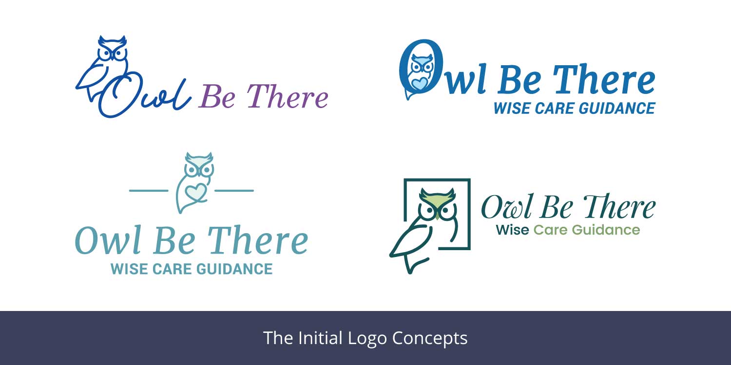
With that in mind, I developed the initial concepts. From the very beginning, I knew I wanted to show Laura something fluid, but strong enough to hold up when used with other elements. Both David and Laura liked the concept which included the owl sitting in the square shape, but they also liked the idea of the owl being built into the “O” in “Owl”. They also were interested in having the owl perched on top of the “O”. After exploring these ideas, David and Laura decided to move forward with the concept of the owl sitting in the square shape.
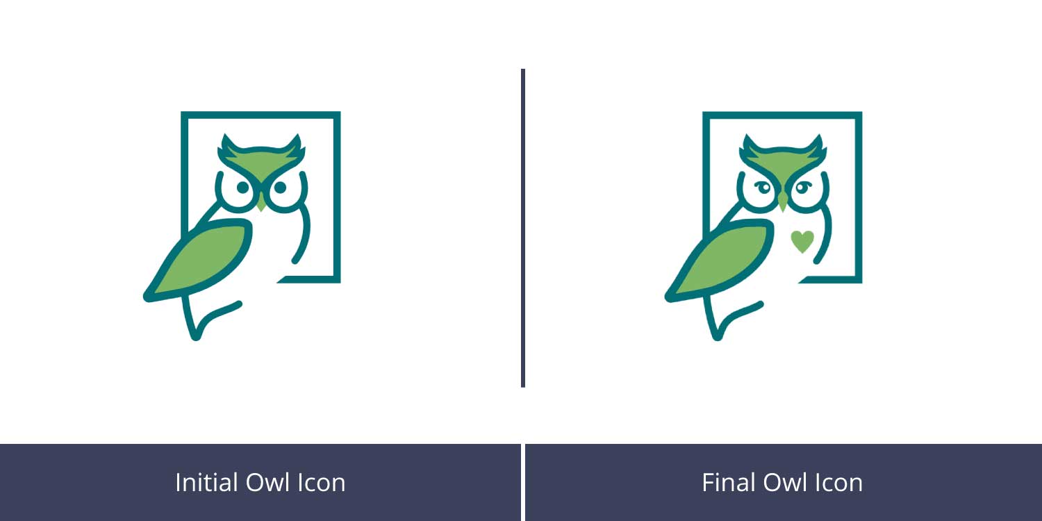
We refined the shape of the owl and placed our focus mainly on the shape of the face and eyes. The original owl’s eyes were simple circles, but we found that they were too harsh. To soften the face, I reduced the space in between the eyes and created a more rounded beak. Changing the shape of the beak from the harsh point to the rounder, softer shape did wonders for creating a friendlier look. The eyes were given more shape and whites were added so they would look a bit brighter and less scary. A heart was added the owl’s chest to symbolize the genuine care that Owl Be There has for all their clients.
We played with several typefaces. We decided on PT Serif for “Owl Be There” and Poppins for the tagline “Wise Care Guidance”. These typefaces express the modern and elegant, yet approachable look that needed to be achieved.
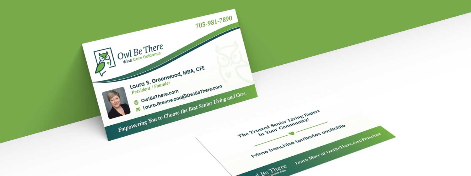
As for color, two green shades were chosen. Green symbolizes refreshment and growth. It can also reflect stability and safety, which were important concepts to convey throughout all the materials. A rich, midnight green was used for the outline of the owl icon and most of the typography. Spring green was used in parts of the owl and to highlight the words “Care Guidance”. A warm, buttery cream complements the green color scheme throughout the brand.
We created a primary logo and several alternate logos for use throughout the brand. The alternate logos were designed to be used on apparel, tote bags, pens, and other promotional items.

Business Cards
Rack Card
The rack card was designed to help prospective clients understand who Owl Be There is and what Owl Be There can offer. An image of a senior and her elderly mother is used on the front side of the card and custom icons were created to complement the copy on the back. The rack cards were printed on a heavy gloss-coated stock for an eyecatching shine. The back side of the rack cards are uncoated for a smooth feel.

Retractable Banner
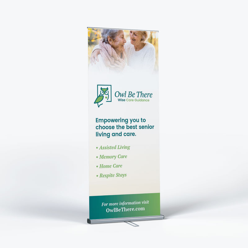
A retractable banner was designed for use at tradeshows and events. Keeping it simple, we utilized the same photo from the rack cards and included a list of senior living situations that Owl Be There can help arrange. A call to action to visit the website is also featured on the banner.
Conclusion
The new identity that was created for Owl Be There is just what David and Laura imagined. The logo is fresh and modern, while still classy and approachable. The rack cards and banner are perfectly on-brand, allowing the team at Owl Be There to skillfully market their service. Laura and David plan to create a version of the business card and rack card for franchisees to personalize in the future.
